14 Mar 2023
Redesigning a high-stakes intervention pathway, where the clarity of the experience determines the quality of on-the-ground actions. A UX approach focused on the readability of statuses, the reduction of friction, and operational reliability.
Context
The artisan application suffered from a significant UX and technical debt: incomplete journeys, interface inconsistencies, recurring bugs, and low readability of statuses, making field decisions unreliable and operationally costly.
Actions
I have taken up the subject as a structuring project: defining a clear and sustainable hierarchy, establishing a mobile design system, standardising UX patterns and strictly framing developments to preserve product consistency. A complete interactive prototype served as a foundation for product, tech and business alignment, and as a support for user testing in the field.
Results
The process has become clearer, faster and more robust: average response time reduced by 50%, NPS increased from 34 to 57, a 42% decrease in errors reported to support, and an 82% adoption rate in three months. Craftsmen are gaining autonomy, support teams are gaining visibility, and operational decisions are being made more quickly and with less ambiguity.
More in detail
Between January and December 2023, I led the complete redesign of the Quotatis Artisans application, in collaboration with the Product, Tech, Data, and Business teams at Adeo. As a Senior Product Designer (UX/UI), I guided the structuring of the design system, user research, and contributed to product framing.
State of Play Before Redesign
Before the redesign, the application presented:
– incomplete and poorly structured pathways
– a strong UI inconsistency and non-standardised patterns
– accumulated UX debt limiting on-ground effectiveness
– navigation poorly suited to constrained mobile usage
Design Hypotheses
We assumed that the redesign of the application should start from the real practices of artisans in the field: mobile, fast usage, often in constrained contexts (construction site, travel, client exchanges). By refocusing the experience on these key situations and introducing a visual and functional consistency through a modular design system, we could enhance their efficiency and restore trust in the tool.
From a UX perspective, this meant structuring the product around three major usage contexts — managing interventions, creating templates for Completion Certificates, and client follow-up — and then reducing cognitive load through better visual hierarchy and unified patterns.
From a product standpoint, we assumed that a smoother, more predictable, and better-organised interface would naturally lead to an increase in NPS, a reduction in reported frictions to support, and more regular adoption of key features.
Finally, from a business perspective, we believed that by simplifying critical pathways, artisans would gain in execution speed and user comfort, directly contributing to improving their satisfaction and strengthening their loyalty to the Quotatis network.
Solution
The redesign was based on a fine understanding of the practices of tradespeople and a gradual structuring of the mobile experience. The work consisted of clarifying critical paths, standardising UX patterns, and establishing a coherent visual and functional foundation that could support the evolution of the product over time.
The approach combined:
• Qualitative user research and in-person testing with partner tradespeople, in order to identify key friction points in critical paths and validate design assumptions.
• UX structuring around the main uses (intervention management, client communication, documents), with unified and predictable navigation.
• Implementation of a mobile design system, ensuring visual coherence, reusability of components, and better maintainability on the front end.
• Interactive prototyping and validation, used as a tool for aligning product, technical, and business perspectives, and as support for iterative user testing.
This approach allowed for the transformation of a collection of heterogeneous features into a clear, robust, and field-oriented experience.
In visuals, it looks like:
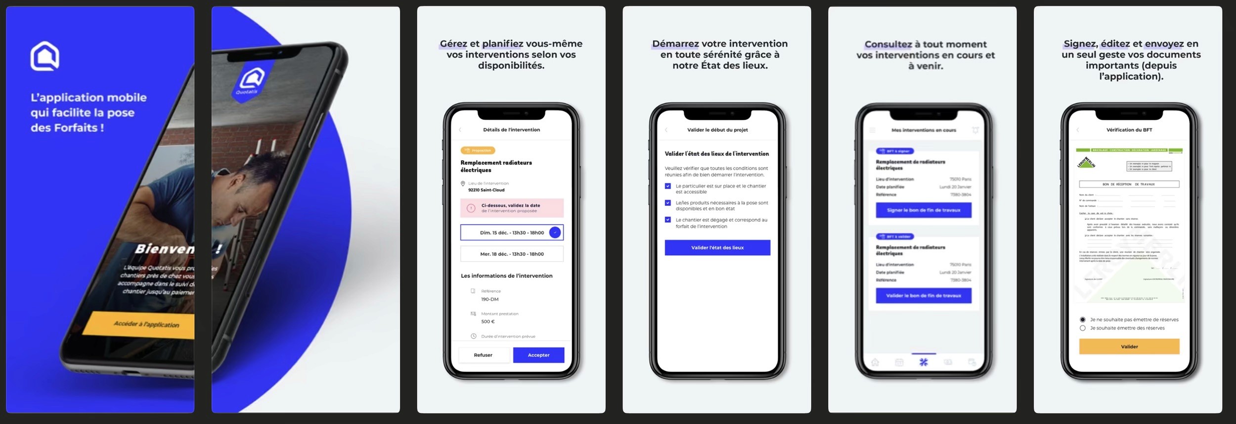
1 - Artisan journey from the beginning to the end of the intervention (generation of the Work Completion Document)
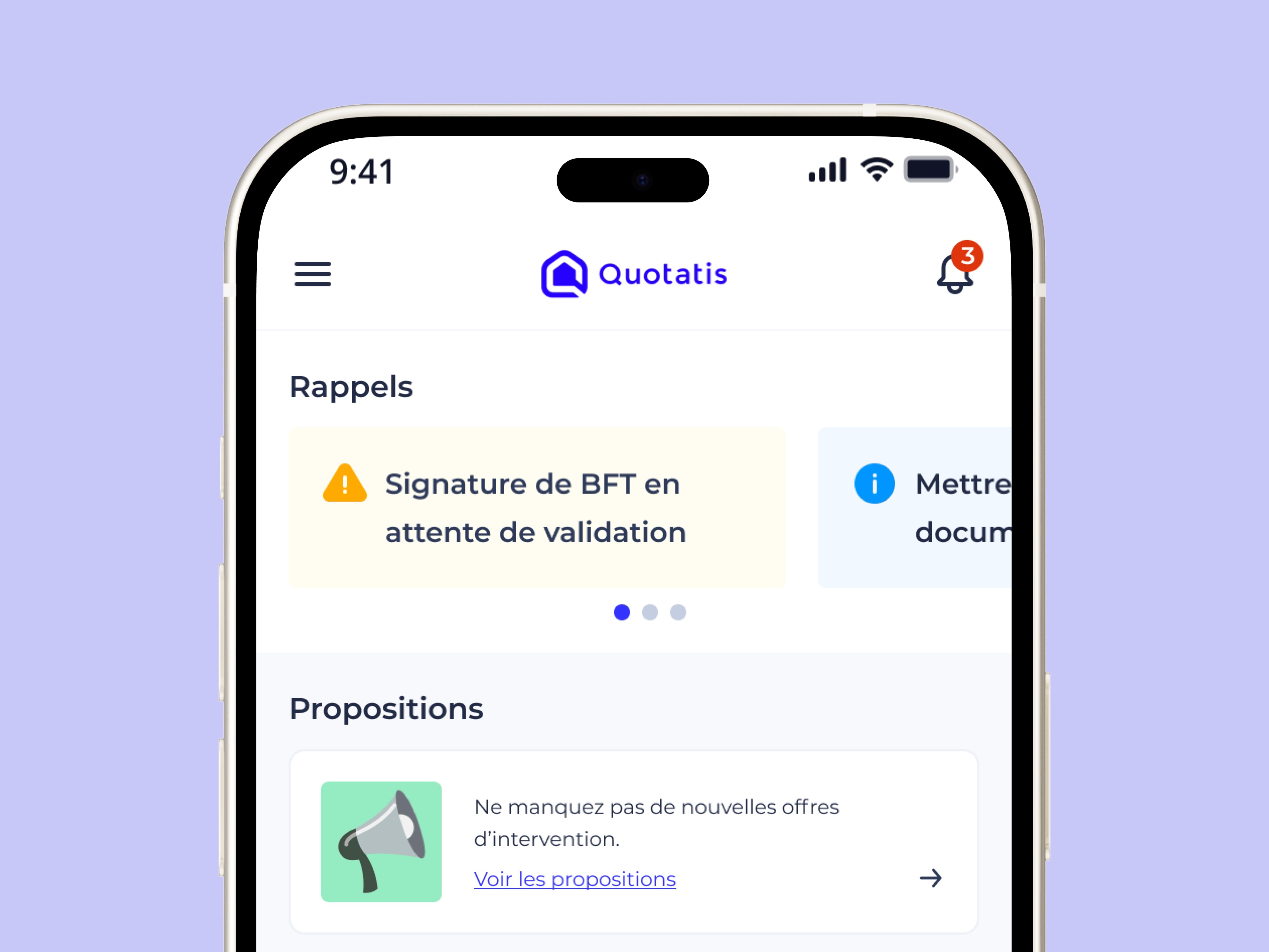
2 - Notification centre, adding granularity to preferences by type of information communicated to the Artisan
Result
The overhaul has produced measurable effects on field efficiency, user satisfaction, and operational robustness:
• –50 % on the average time needed to complete an intervention (from 4m20 to 2m10).
• +23 NPS points (from 34 to 57), reflecting a net improvement in the perception of the tool by the tradespeople.
• –42 % of errors reported to support, thanks to clearer journeys and more explicit statuses.
• 82 % adoption of the new version within three months, confirming a smooth transition to the new experience.
These results reflect a quicker uptake, increased autonomy of the tradespeople, and better visibility for the support and product teams.
Key Learnings
• A sustainable design system is a structural lever in a multi-app context, both for UX consistency and delivery efficiency.
• Experience symmetry between field users and internal teams is essential to make reliable decisions and reduce operational friction.
• Documenting and making UX debt visible facilitates decision-making and allows for objective prioritisation of redesigns.
• The close integration of design with product and tech from the early phases maximises impact and limits costly iterations.
🔒 This project contains private strategic elements.
Product arbitrages, organisational decisions, business constraints... A detailed version is available on request.
