
21 Jul 2025
Structuring a client check-in to transform vague input into usable data. A UX redesign focused on data quality and reducing risks associated with the movement of craftsmen.
Context
Client check-in relied on imprecise and loosely defined input, generating partial or ambiguous information before intervention. This weakness upstream exposed field teams to unnecessary trips, client misunderstandings, and avoidable operational risks.
Actions
I rethought the check-in as a guided decision-making process, structuring the questions, statuses, and completion rules to make uncertainty explicit and the data workable. The work focused on prioritising the information that is truly useful for the intervention and on ensuring the reliability of the answers before validation.
Results
The quality of the data collected upstream has significantly improved, allowing for better prepared and more predictable interventions. Artisans have more reliable information before travelling, operational risks are reduced, and corrective exchanges with the client or support are clearer and less frequent.
More in Detail
This project is part of a recurring issue in field services: the quality of the data collected before intervention directly influences the prediction of the success of an operation.
The client check-in, a key point of contact beforehand, played a crucial role in preparing artisan movements, but it was not designed as a true strategic tool, to which sufficient time and thought had been devoted.
The challenge was not only to improve an existing form but to rethink the check-in as a structuring step in the Customer journey, capable of transforming vague information into data that can be utilized by the entire operational chain.
State of play before overhaul
Before intervention, the check-in relied on free and loosely defined input, generating several structural problems:
Heterogeneous information, difficult to compare from one client to another
Areas of uncertainty not explicitly stated, leaving room for interpretation
Proposed interaction mode for the Client sometimes perceived as designed backwards, poorly understood.
Late discovery of critical elements (access, technical constraints, client context)
Tradesperson travel insufficiently prepared, or even unnecessary
Frequent back-and-forths between support, client, and tradesperson to clarify the situation
Countless iterations on wordings rather than on the form itself
The check-in produced data, but not reliable or directly actionable data. It fulfilled a data entry obligation, without truly securing the continuation of the journey.
Design Hypotheses
We have made several structuring hypotheses:
The quality of the data does not depend on the volume of information collected, but on its structure and readability
Uncertainty must be made visible, not hidden behind open fields
An effective check-in must guide input without overloading cognitive load
The collected data must be considered in relation to its future use (preparation, intervention, support)
The objective was therefore to transform the check-in into a tool for operational preparation, rather than a mere administrative step.
Implemented Solution
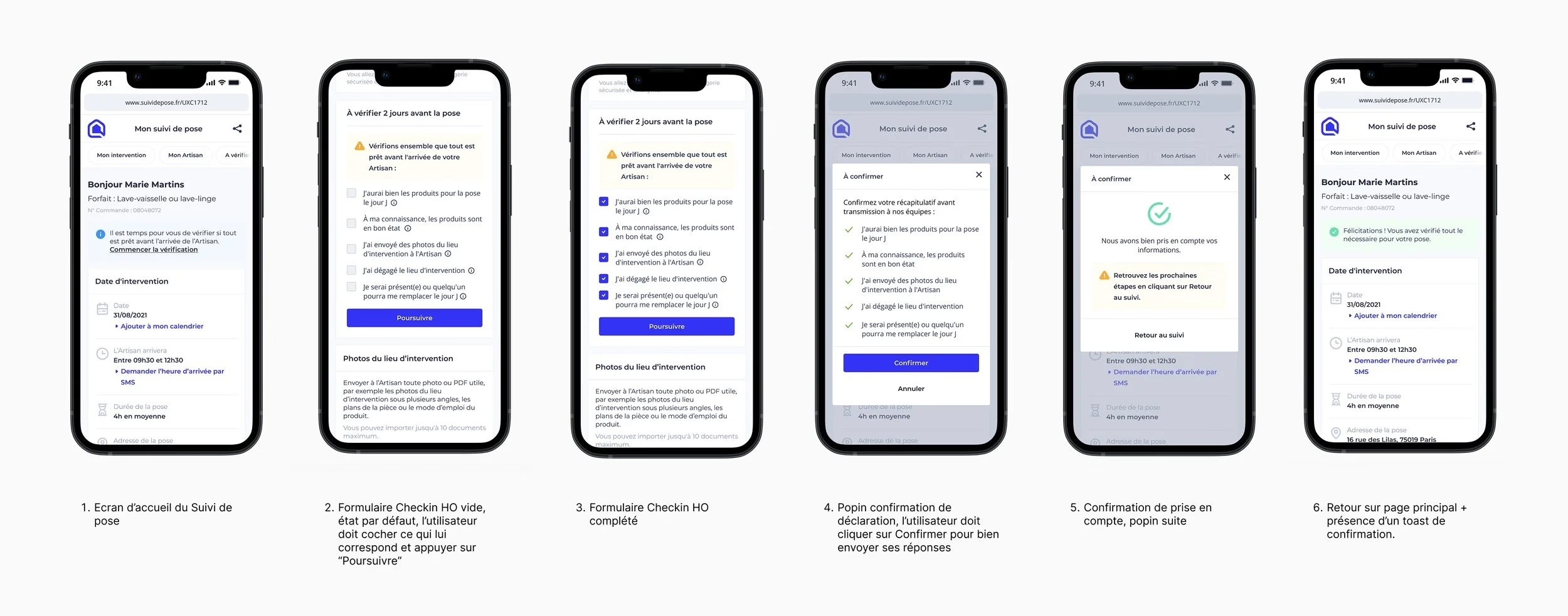
The redesign involved rethinking the check-in as a guided decision-making journey, structured around the actual needs of the intervention.
The work revolved around several axes:
Structuring questions: prioritising the information that is truly useful for the intervention, eliminating ambiguous or redundant fields
Conditional logics: adapting the journey based on the responses, to avoid overload and focus on the essentials
Explicit completion rules: clear distinction between mandatory, optional, or unknown information
Clear statuses and signals: output from the check-in producing readable and usable data, rather than interpretable text
Readability before validation: highlighting key information and areas of remaining uncertainty
The overall aim is to ensure the reliability of the data without complicating the experience, by supporting the user rather than constraining them.
In visuals, it looks like:
Demonstration of the completely revised journey:
Observed Results
The redesign has led to a significant improvement in the quality of the data collected beforehand, with direct impacts on the ground:
Better prepared and more predictable interventions
Reduction in unnecessary or poorly anticipated travel
Fewer clarifications afterwards with the client or support
Better understanding of the context before the intervention, on the craftsman side
The check-in becomes a lever for operational security, rather than an additional point of friction.
Key Learnings
A form can become a decision-making tool if it is designed as a journey
Making uncertainty explicit improves the overall reliability of the system
Guiding input is often more effective than multiplying mandatory fields
Data quality is a UX issue as much as it is a product and business concern
🔒 This project contains private strategic elements.
Product arbitrages, organisational decisions, business constraints... A detailed version is available on request.
